Gali Gaviria

Product Designer · Fintech & Proptech

From problem to live product.

End-to-end product designer: research, UX/UI, brand, and build. I take ideas to market using design and AI-augmented development, without waiting for a team to get started.

About

I'm a product designer: I take an idea and carry it through to a real product that solves a real problem. From the first research to launch day, without waiting for a dev team to start building.

I've built my experience in two sectors that demand precision and trust: fintech and proptech. At Horizon65, a German fintech in pension investment advisory, I grew over four years from junior designer to de facto product lead. With Clavis.casa, my own venture, I'm founder and product lead: from the idea to field validation, through the go-to-market phase I'm running right now.

Before product design, I coordinated maintenance and renovation crews for luxury retail stores across different cities, often remotely, working within very tight windows and zero room for improvisation. That way of working, surgical, coordinated, planned in detail but ready to react to the unexpected, is the same way I work alongside developers today: understanding what they need to move fast, and building the material that lets them do it.

Research & UX
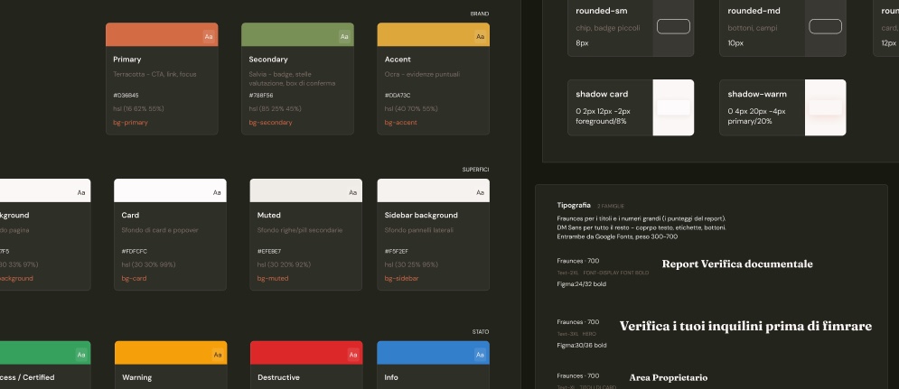
Brand & Design Systems
AI-augmented development
Fintech
Proptech
Go-to-market

Case studies

Work

Two products, two different stages of the product lifecycle: one just born and entering go-to-market, the other grown over four years into a difficult but learning-rich shutdown.

01

Proptech · Founder & Product Lead

2025-now

Live product · go-to-market phase

Clavis.casa

Fewer wasted viewings, faster and safer long-term rentals.

Founder, Product Lead. Research, UX, brand, design system, and building the product itself, end-to-end, entirely on my own.

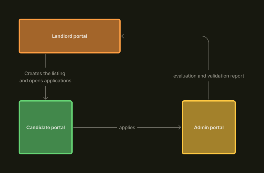
Clavis.casa is a mobile-first web app that screens prospective tenants before a viewing, validating identity and financial solvency and helping flag risk signals in documents. It comes directly from my own experience as a landlord in the long-term rental market, where wasted viewings are a huge time cost for landlords, agencies, and property managers.

Visit Clavis.casa

Founder & Product Lead

Role

71 → 4 confirmed viewings

Pilot test

5 min, being reduced

Screening

Live product

Status
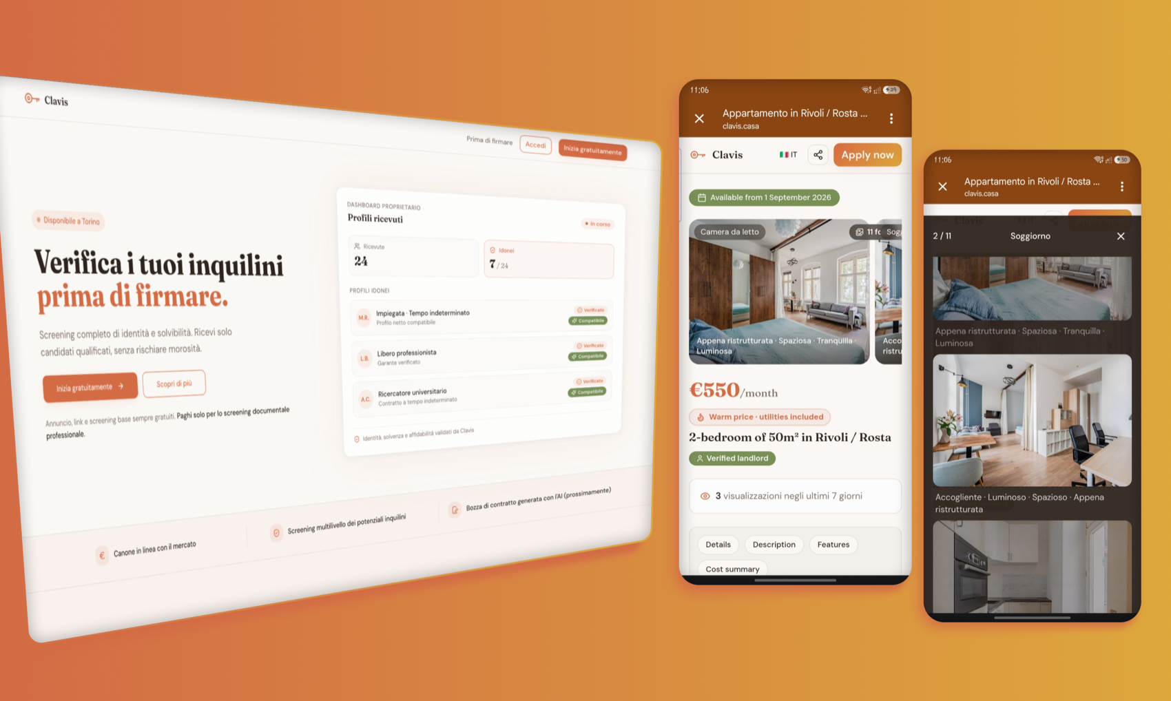
The homepage on desktop
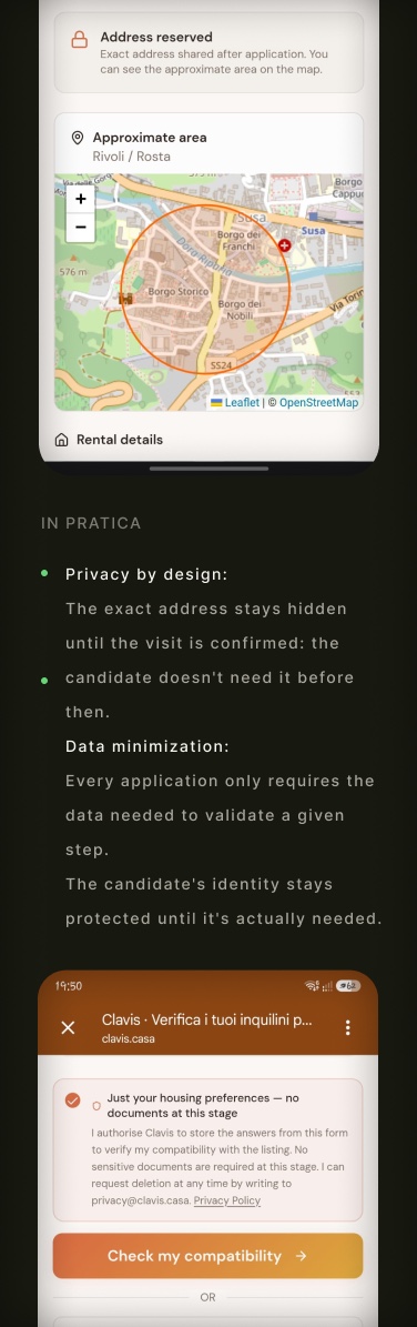
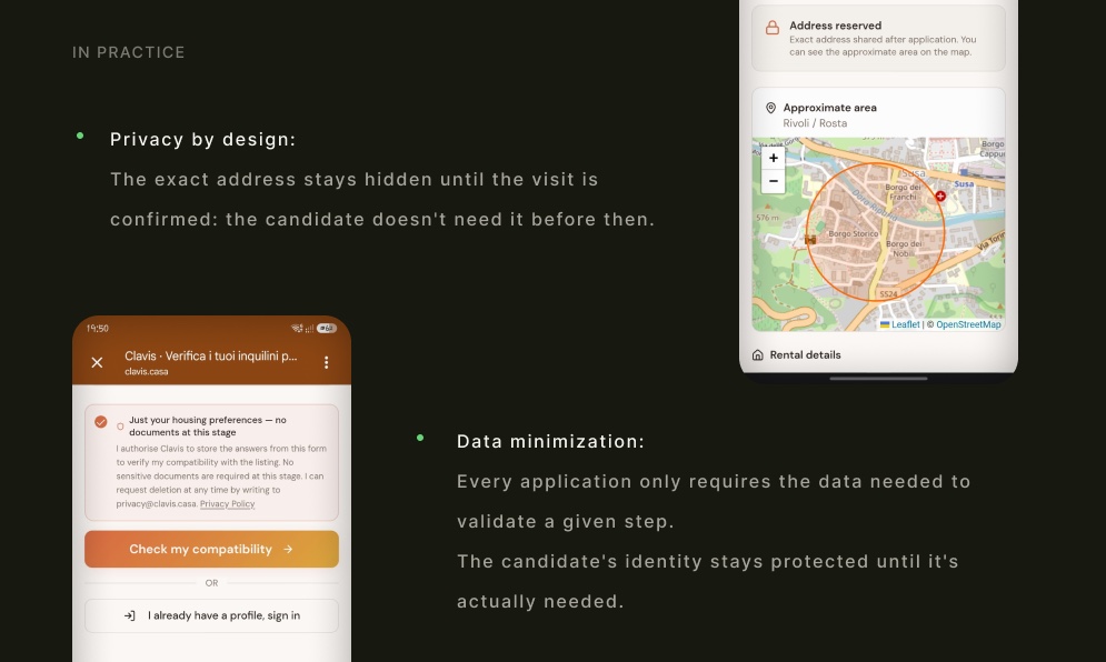
Privacy by design: the exact address stays hidden until the application
The generated listing: real photos, price, verification badges, live stats

Some parts of the process (the landlord onboarding, the internal dashboard) stay private: Clavis.casa isn't a registered company yet.

The problem

Every rental listing generates dozens of contacts, but only a fraction are genuinely qualified: people who never complete anything, agencies fishing for leads, candidates who fail even a basic identity or income check. The result is wasted viewings, lost time, and decisions made without enough information.

I lived the problem first as a landlord, before I approached it as a designer. That made the research phase an exercise in continuous validation: analyzing public comments on the topic, interviewing tenants and landlords, and a competitive study to figure out how to position myself against existing players. Not designing what I assumed was needed, but what market data, and a real field test, actually confirmed.

The process

01

Research and problem validation

Analysis of insights from the rental market, problem definition and validation, all UX research carried out independently.

02

Brand, UX and design system

Name, tone of voice, design system, and the decision, a direct outcome of the research, to go mobile-first, applied across every interface choice.

03

Building the product

I didn't stop at the design: I built the product myself, without waiting for an external dev team, using next-generation tools that let me iterate in days instead of months, always keeping control of the decisions, from the user flow to the database.

04

Field pilot test

A real test on one of my own properties, to validate trust in the platform, flow fluidity, and whether the screening actually worked, before any investment at scale.

The pilot test: what I learned

I listed the property on Idealista with an application link to Clavis.casa, without telling candidates they were part of a test. The goal: find out whether people unfamiliar with the platform would trust it enough to upload personal documents, how smooth the flow was, and whether the screening genuinely worked.

Total contactsFrom the Idealista listing
71
L1 self-certificationAccount created, tax ID and email verified
17
L2 document validationDocuments uploaded and verified, shortlisted by the landlord
5
Viewing confirmedAccepted the invite and picked a time slot
4

69% of the 71 contacts were valid profiles (the rest: ignored links, agencies fishing for leads, one technical issue). Only 34% completed self-certification, and from there document screening selected the 5 strongest profiles. The physical viewing stage is what I'm following up on now.

From screening time to scale

Screening currently takes about 5 minutes, assisted by an OCR reader for document extraction. It's the first number I want to cut down: I'm working to make verification near-instant.

I don't have a waiting list yet: a limitation I'm aware of, and part of the go-to-market work I'm tackling right now, alongside growing the number of landlords and agencies on the platform.

What I learned

  • A real test, even a small one, beats ten interviews: how people behave in front of an unfamiliar form is different from what they say they'd do.
  • The screening works: going from 71 contacts to 4 confirmed viewings is a qualification rate no manual check could match in the same time.
  • Being founder, designer, and, in practice, product lead of a team of AI agents requires a different kind of discipline: every design decision has to be clear enough to be translated into instructions for actually building it.
FigmaLovableClaudeClaude CodeSupabaseResendCloudflare

Need something like this?

Send me an email
02

Fintech (Germany) · Product Designer → Product Lead

2021-2025

Closed project · 4 years, from research to the product team's shutdown

Horizon65

From qualified lead generator to an educational platform for pension investing.

Joined as a junior designer straight out of bootcamp (Ironhack UX/UI, mid-2021), and grew into de facto ownership of research, design system, and the direct relationship with developers and the CTO.

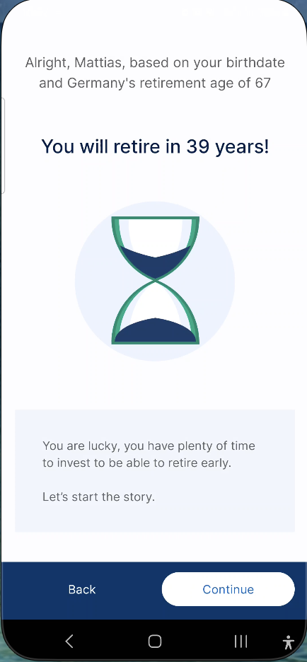
Horizon65 is a German fintech in pension and insurance investment advisory. The app was meant to generate qualified leads for in-house financial advisors: I helped evolve it from a simple lead-gen funnel into a simulation product designed to educate users, up until the product team's shutdown due to market conditions.

Designer → Product Lead

Role

1% → 25-45%

Conversion

1.3 → 8.3 min

Time on page

4 years

Duration

The first problem: conversion

The first big problem to solve was the funnel between Meta ads and account creation: it barely converted. I ran a survey of 300 people to understand how Germans relate to pension investing, analyzed the existing product's performance, and defined a new path.

It took 16 prototypes and 4 final versions over a month of testing before testers approved the solution. It was my first real professional test: I learned the humility of staying true to the findings even when instinct suggested a shortcut.

From prototype to product

01

From design to developers

I built the developer-ready prototype working directly with the founder, who was also the CTO, defining myself exactly what needed to be built.

02

Live in a week

The new funnel went live after a week of development.

03

Every sprint, a round of testing

For every project, from onboarding to the simulator, from the comparison table to the asset forms, we defined sprints: we only moved to the next one after at least one round of testing with testers.

The result

Ad-to-account-created conversion

1%0%

peaks of 45%

It was the start of everything: from there, my role in the company grew well beyond interface design.

What that onboarding actually contained: a time machine

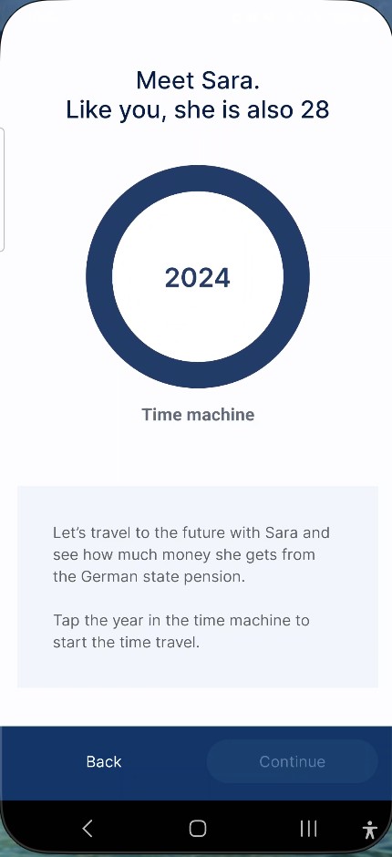
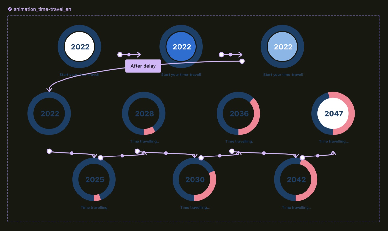
The idea behind it was simple but a little brutal: let people know what was coming, so they could prepare in time. After name and date of birth, the first hit was an estimate of when you'd retire. Then, instead of showing your own numbers right away, the app told the story of a character your same age: a device to teach the mechanic before making it personal. A time-travel jump to 2063 to find out that her pension would only cover 46% of her income, according to official German statistics.

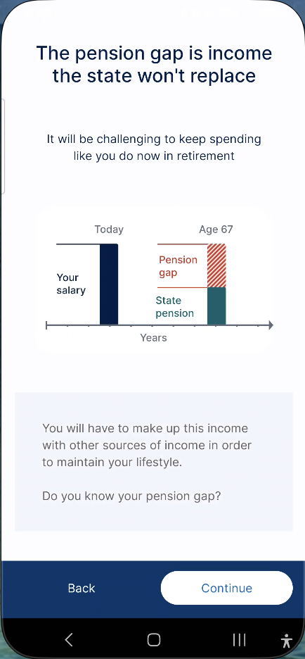
That difference was called the 'pension gap', explained with a simple diagram: full income today, halved income in the future. It was designed to shock, to create a sense of urgency, and to lightly introduce the alternatives that existed. It was a long onboarding, working against every best practice about brevity and friction, but it's exactly what triggered the jump in conversion from 1% to 25-45%.

From there, the account was created, and a series of questions followed to actually populate it: marital status, identity verified by SMS, your own state pension. By the end, the app was already showing the first solutions to close the gap: from fear to the promise of an answer, in just a few steps.

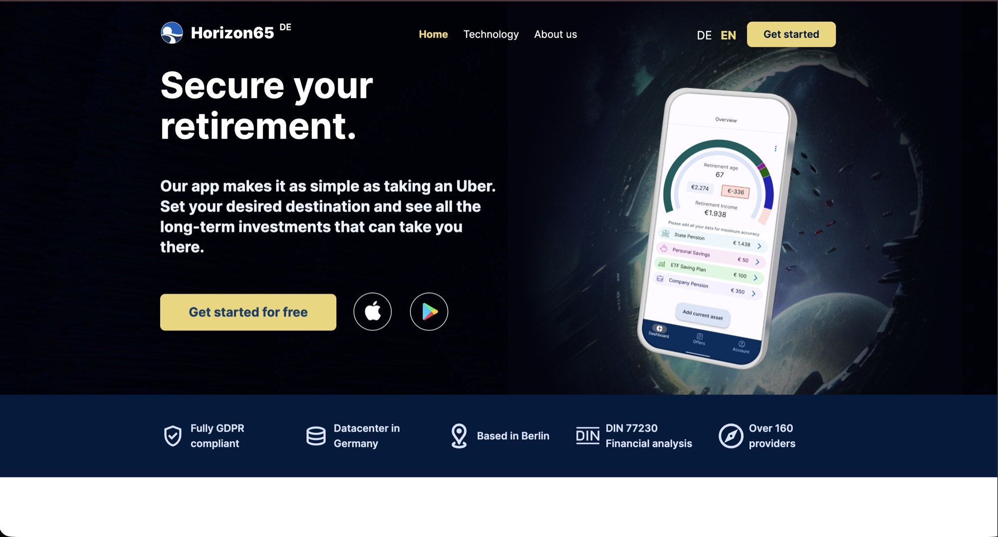
The welcome screen: 'Your personal financial advisor for your retirement'
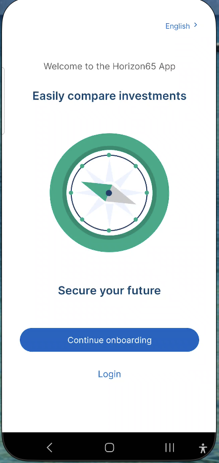
It starts with your date of birth, to estimate when you'll retire
The first hit: 'You will retire in 39 years!'
'Meet Sara, she's your age': the time machine
The result: only 46% of current income, according to official statistics
The 'pension gap' explained as a diagram: today's income vs. future income
'Let's find out': from here, the real data collection begins

The simulator that tripled time on page

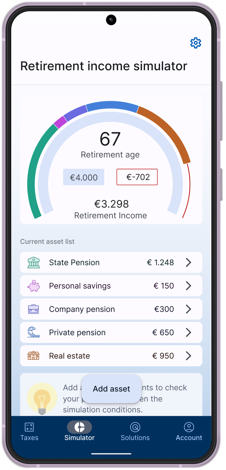
With conversion solved, the next problem was retention: after onboarding, users kept coming back to a fast but inaccurate simulator. I worked on both the interface and the messaging: every setting became clear, with no need to guess which number to enter because it was suggested and explained, and I updated the chart colors while keeping the same interactivity. The result exceeded expectations, and the company gained authority in users' eyes as a subject-matter expert.

The 'book your consultation' button remained a delicate spot: the sales that followed depended a lot on the individual advisor's skill, more than on the app's promise, a sign the product alone wasn't yet closing the loop. With few real users to test on, we chose to work with an external testing panel, protecting the company's credibility in the meantime. The result was valuable: people like to investigate on their own, before trusting whoever is selling to them.

The result

Average time on page

1.3 min0.0 min

almost 6.5x the starting time

Time spent exploring their own numbers became the strongest trust signal for the product.

The simulator with the user's real data: average time on page went from 1.3 to 8.3 minutes
The strongest innovation: suggested, explained values, nothing to guess
Scenario-based simulation: worst-case, bad-case, normal, projected over time

The comparison table: team pride, and where the flow broke

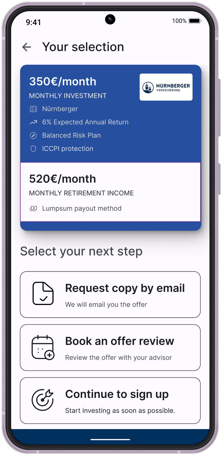
The product aimed for a precise idea: educate people enough to let them choose the investment on their own. A short questionnaire led to a comparison table that worked beautifully, a team result I'm still proud of, with filters and selectable options. From there, whoever had made a choice could proceed in three ways: get a copy by email, book a review with an advisor for confirmation, or go straight to signing up, without needing to talk to anyone.

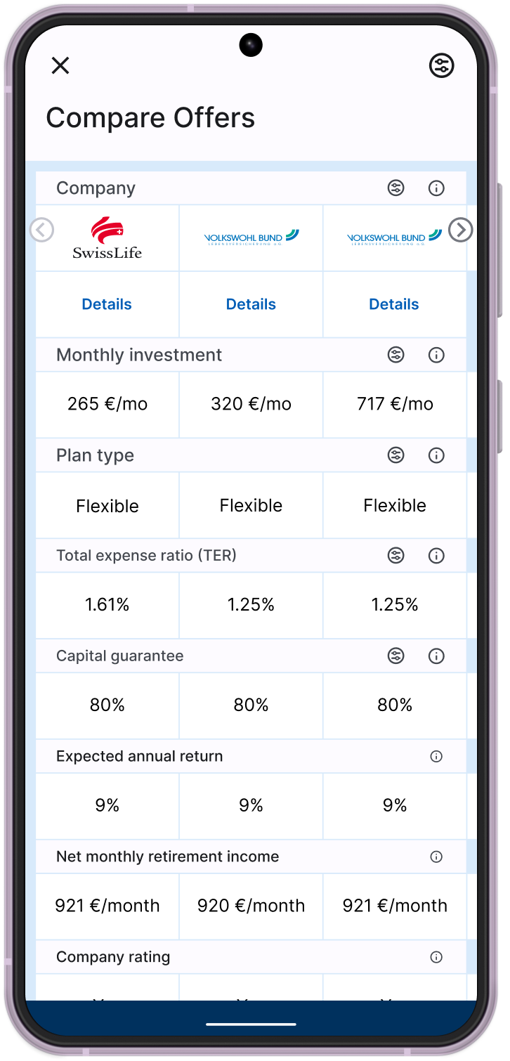
The critical point was exactly when a user chose to discuss it with an advisor: their choice and reasoning didn't arrive with enough context, and got lost in the handover. Further upstream, the real issue was that the financial content behind the simulations wasn't developed well enough yet: results looked flat and interchangeable, as this screen shows, three providers with the same 9% return and around €920 net monthly income each. Without real differentiation to point to, the advisor's job got harder too.

The commercial pace aimed to close fast, while the product was designed to nurture the lead over time: an interesting mismatch in hindsight. The more information we gave, the more questions arose in the user's mind, and sometimes the less transparent competitor came out ahead. We discovered, a bit too late to test for it beforehand, that our more educated users would call several market players to compare discounts, and pick whoever offered the biggest one: a valuable lesson about loyalty built through transparency, more fragile than we'd hoped.

After the questionnaire: the scan searching for solutions to close the gap
Three different providers, the same return: 9% everywhere, ~€920/month everywhere
Three paths after the choice: email copy, advisor review, or direct sign-up

The tax pivot, and the second onboarding

In parallel I supported marketing, mapping the entire path from social to the website to onboarding, in a saturated market where an ad would get copied by a competitor within two days. When the original onboarding became outdated, we discovered that taxes had become the most effective angle in ads: that's where a second onboarding came from, three interactive, animated screens, each explaining one step of how tax deductions affect real income.

From that point on, the app opened on taxes, not on the pension simulation. That angle, too, was soon replicated by competitors.

The second onboarding: how tax deductions change real income
The calculation builds step by step, not through explanation
The final result: how much deductions lower taxes

Making asset entry self-service

A part of the work I particularly care about: moving asset entry from uploading bank statements and contracts, which an advisor then had to read and interpret, to forms designed to be filled in independently, without waiting for anyone.

The hardest part was real estate, because it uses terms that aren't common knowledge outside the industry. My architecture background helped there: I already knew those terms well, and could translate them into a form that was clear even for people who'd never heard them before.

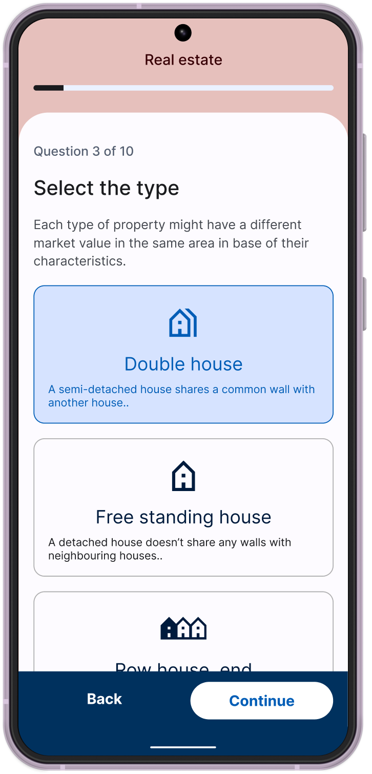
Selecting the property type, with an explanation for every technical term
Self-service real estate asset form: current value, future projection, maintenance costs

The pivot we saw coming, and the shutdown

I had spotted a pattern I believed could work: turning the product into a B2B tool supporting financial advisors broadly, not just B2C. For the founders, though, it was a time to consolidate rather than take on more risk: with the German recession underway, it made sense not to expose the capital they'd built to new unknowns before investing further in a long-term product. A decision I understood, even as the pattern I'd spotted kept nagging at me. The product team was scaled back to wait out the market.

I stayed on to support the ads side, then chose to move toward a project that offered real, concrete work. One thing I still carry with me from that time: I defined how we worked with developers, understanding what they needed and building the graphic material that fit their workflow, to the point where we could ship a new feature in just two weeks.

What I learned

  • Staying true to the findings, even when the result feels risky, is what makes a test worth running.
  • Sometimes the right choice goes against standard best practice: a long, shocking onboarding beat every rule about brevity, because it answered a real emotional need.
  • An 'educational' product is only credible if the content behind the interface is as considered as the interface itself: otherwise the promised differentiation never shows up.
  • User loyalty built on transparency is valuable but volatile: it needs to be tested, not assumed.
  • A strong working relationship with developers comes from listening to what they need to move fast, not just handing off finished designs.
FigmaUser researchA/B testingDesign systemsProduct marketing

Need something like this?

Send me an email
More work

More work

Smaller-scope projects where I worked inside existing teams and processes. A different signal from Clavis.casa and Horizon65, but just as useful: I can slot in, follow given requirements, and collaborate with PMs and tech leads.

Defensetech · Landing page

Smash Electronics

Design & build (vibe coding)

A short research phase with the founder to understand the project, the logo defined together with him, then a landing page proposal built directly in vibe coding, liked from the first version and live after a few rounds of corrections.

Visit Smash Electronics
Landing page: technical positioning for G-hardened electronics in aerospace and defense

Proptech (Spain) · Feature for the internal team

Vivara · GCO Ventures

Product design, against Product Manager requirements, in collaboration with the Tech Lead

A feature supporting the internal team in managing, improving, and publishing the images sent in by property owners, part of a larger initiative to publish listings on Idealista.es. I followed the Product Manager's requirements and took the solution through to a clickable prototype to discuss technical feasibility with the Tech Lead, then prepared the graphic files to support development.

Hand-drawn lowfi → Figma midfi → Clickable prototype (Figma Make)

Hand-drawn lowfi
Figma midfi
Clickable prototype (Figma Make)

How I work

Skills

Research & Strategy

  • User research and problem validation
  • Surveys and quantitative analysis
  • Field testing and A/B testing
  • Business model definition

Design

  • End-to-end UX/UI
  • Design systems and brand identity
  • Prototyping (Figma)
  • Mobile-first design

AI-augmented development

  • Lovable, Claude, Claude Code
  • Supabase, Resend, Cloudflare
  • Direct collaboration with developers and CTOs
  • From prototype to live product

Contact

Let's work together

I'm available for end-to-end freelance work in fintech, proptech, and beyond: from research to a live product. Get in touch.

Send me an email · gali.gaviria@gmail.com